Showing posts with label Of a Summer's Day. Show all posts

Friday, December 27, 2013

Back to Plan A


In between and round about all the holiday festivities, some progress has been made on Of a Summer's Day. There as been a good deal of hemming and hawing about what to do next. For a good while I was convinced that the quilting needed to happen next. I think that maybe I was suffering from "done is better than perfect" syndrome.

After walking around the project, all laid out on my cutting table, spools of thread and all, I began to realize that I wanted more for this little quilt. I have been seduced by embroidery, which is something that I've loved all my life. In fact, it was the very first needlework I ever learned, from my Grandma, when I was just four.


I'm taking my time with this, because I think this little quilt could be something special, which is probably putting way too much pressure on myself. Not probably, nope, it's fairly obvious that the desire for perfection (or at least my bestest best), is what's keeping from me moving forward at a reasonable pace.

Just when I think I've licked that damnable beast, perfectionism sneaks right up and bites me hard on the butt. I guess that's why I say I'm a recovering perfectionist. Does anyone ever really recover?

I'm getting the itch to start something new, but would also hate to leave this little quilt undone. Little seasonal quilts are coalescing in my heart, and Valentines' Day is not so far away.

Monday, October 28, 2013

Plan B


I have made woefully little progress on Of a Summer's Day. I am still struggling with the order of work, embellish first, or quilt.

The larkspurs have been outlined with coral stitch, and I am happy with that result. But as I began to add in embroidery details to the leaves and stems, I had a crisis of confidence. I can accomplish the same look with my quilting lines. Indeed, I will want to stitch in the ditch around all of the applique to enhance the dimensionality. Hand embroidery now will just cover exactly where I want to stitch.


So, it's off to Plan B. I've pulled some of the thread for quilting in details. I see that I forgot to pick out some yellows for the coreopsis. Instead of my usual choice of fat threads for dramatic effect, these are fine threads, for a more subtle look.

It must be that I am pretty invested in this pattern for it to be giving me so much grief. Maybe it's because I have no deadline, or publication plans. Either way, I would like this project to end up being top notch, and that's a lot of pressure. I find myself wanting this to be "the" best instead of "my" best. Silly me, way to suck the joy out of what should be a fun and interesting adventure. I think it's time for me to get over myself and get working.

Monday, October 14, 2013

Embroidering Of A Summer's Day


At last! The cold has been conquered (more like endured), and I feel like I'm back to as close to normal as I'll ever get. I can knock it off my to-do list. Finishing up is so gratifying, isn't it?

There really isn't much left to do on Of a Summer's Day. Everything is stitched to the background. I could just jump to the machine quilting and call it good. I could finish it in an afternoon. But I'm still thinking. I'd like to add some embroidery. I have all the floss picked out and ready.


What a yummy pile of colors. Before settling on floss, I had a whole pile of pearle cotton ready to go. In the end I decided that being able to separate the strands would give me more flexibility.


Just as my students do, I am lamenting how truly awful the stitching looks. There is nothing invisible about this work! But I know from long experience that batiks do look terrible at this stage, because of how tightly woven they are. And I know that by the time the wall hanging is done, the stitches will all but disappear. But still... it's tempting to give it a quick swish in the sink to soften up the edges.

I'm also still working out the order to work. I'd love to embroider in serrated edges on the rose leaves, but then how would I quilt that? Seam like my usual stitch in the ditch would mangle up that edge, unless perhaps I gently echo the embroidery. I'm having a little bit of "but first" syndrome here, to finally decide on the best order of stitching. Help me out here, what do you suggest?

Saturday, August 3, 2013

On the Newsstands Now


This is the super secret project I mentioned earlier this summer. It is a new favorite quilt for me. It's in the current issue of Quiltmaker, on newsstands now. (I just saw it in the grocery store, and got a nice giggle when I saw my name on the cover. Bazinga!)

It signals the beginning of a new approach to my applique process. The working title for the article was "Hand Applique by Machine, By the Numbers", sort of a take on the old paint by numbers kits we used to buy as kids. (I don't remember what the end title was in the magazine, probably something close.) If you'll excuse the pun, it's a way to be a little more painterly in my fabric choices.

I've modified the addressing system that has kept my sanity all these years from being just a way to keep track of all the pieces to focusing more on light and shadow and fabric choices. I've gone from mass producing perfectly matching motifs by the hundreds to cutting shapes out one at a time to give each a little special character.


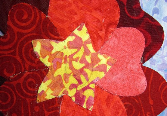
I've used sort of the same idea with my Of a Summer's Day project (which hasn't changed a bit from this earlier picture, maybe next week.) I've tried to use light and dark to give the roses a little more dimension. I started working out the new labeling system on this project.


Here's a close up to show the quilting. I think the overlapping circles on that upper fabric reminds me a bit of the movement in some Van Gogh paintings. The lower fabric is quilted in vertical straight lines, a nice contrast to the circles and curves above.


Hand embroidery was added for a little more definition, and to add details too small to applique. (Okay, I have to admit that I could applique the stems, I just didn't want to.)

Even in my large quilts I've always been mindful of value placement. It can make a quilt sparkle. What do you think, would you like to have your applique patterns tell you where to place the lights, mediums and darks for a certain look? Is that even something that matters to you in your projects?

Wednesday, June 19, 2013

Yellow or no yellow, that is the question

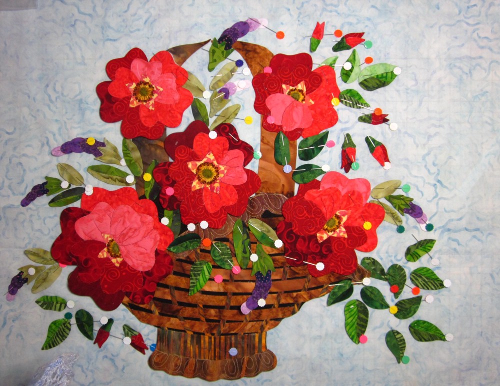
Moving forward again on the On a Summer's Day project, finally! Almost everything is pinned to the background. I seem to be a larkspur short of a quilt (no surprise there). I'm hoping it will magically appear while I'm making other choices. After looking for several days for the leaves, I found them exactly where I had put them: in my project bag for my last teaching trip of the year.


All the dots are the heads of the flat flowerhead pins. Those babies are sharp. There was a whole lot of ouching going on as I pinned more and more pieces. I'm just glad that I didn't bleed on the thing.

Clearly I still need to add in the stems, but I have to decide which will be fabric bias stems and which will be embroidered in.The butterflies have been left off as well. I had planned for one in the upper left and the middle right. The missing larkspur should be right at the top. I'm not at all sure that it needs to be replaced.


Now the little yellow flowers have been added in. I fancy them to be little coreopsis zagreb, named for a small town in Croatia, where my grandparents are from. Along with them, feathery ferny leaves would be embroidered. I moved the top larkspur over just a smidge, and now I don't think the a.w.o.l. flower is missed at all.

Yellow or no yellow, what do you think? I'm tending towards the yellow, and I think it also needs a few more. Just a couple up top, and maybe in the lower left. Yes? No?


Tuesday, June 4, 2013

Beth quilts!


At last! All of my deadlines are met. (I did do a super secret project that you will be able to see this fall.) And I can finally get back to my own applique project. The project went into hibernation when my crazy travel schedule started, but more importantly, when I couldn't decide on a background. I really, really, really loved the one on the left, but it does overpower the applique, sigh. And the one on the right is too close in color to the larkspurs.


One of the nice things about travel is the opportunity to visit new quilt shops. If only I could remember which city this was in! I came home with several candidates for the background, and this one won. It's a little more vibrant than this shows, it's mostly a robin's egg blue with hints of a purple undertone.

So, with that, I could get back to the embellishing. My mind is just too literal sometimes, and I just couldn't get past the idea that veins are usually indented, not elevated. Embroidered lines are elevated. Luckily I hadn't gotten very far (I think I knew I wasn't going to like it in my heart of hearts), so it wasn't hard to pick out.

I did want to add more dimension to the roses, so I pulled out the heat n sta fleece from Floriani.  It's what I used on the basket rim and base.


Using my trusty light box and a sharpie pen, I traced the shapes I wanted to emphasize, and then cut them out. After the first one I realized that there was no need to trace each shape if I was going to cut it out as a unit.


There were also places that I wanted to really push forward, so additional little bits were cut. My original plan was to layer the fleece with the smallest parts pressed in place first, and then secured with the larger, overlapping piece. But in the end I decided to do just the opposite, adding the smaller bits on top of the larger, hoping that would reduce any lines or sharp drop offs.


My next thought was that I needed to add free motion veins in my emphasized areas before I put the motifs on the background, which would allow those areas to retain their puff.


From the back side you can see how the fleece was layered and then stitched through. Every one of this steps are a bit of an experiment for me. I'll only know if they were effective when the quilt is done. It's so very lovely to have the time to hash this out. A project without a deadline is just way more fun.

The remaining embellishment will have to wait until the motifs are stitched to the background. The roses and basket are in place, the little yellow flowers are awaiting their placement. Now, if only I could remember where I put the leaves and larkspurs. Well, where ever they are, I'm sure they're safe.

Sunday, March 10, 2013

To bead or not to bead


Moving along on the Of a Summer's Day quilt. Progress has been slow since being seduced by a spinning wheel, but there's progress nevertheless. Deciding how to embellish the appliques is a bit of a challenge to me. I'm not really big on glitz and glamour, but a well placed bead is a thing of beauty.

I started by leafing through an old picture book of rose botanicals, looking for just the right center treatment for my old fashion roses. Once I found the look I was after, I marked the centers with concentric circles. (A circle template from an office supply or drafting store is a marvelous thing.) The size and placement were done totally by gosh and by golly. I did make a small attempt to center the middle circle, but there was no measuring involved. The circles also varied from flower to flower.


I gathered up the tools for embellishing and set to work. Starting with straight stitches from the center to the outer ring, I used the darker variegated thread to create the stamens. I rustled up a strip of wool I had cut and stashed in my aborted stab at rug making, to create the centers.


It sat at that stage (and of course, I didn't take a picture) for several days while I wrestled with the decision between french knots and beads. I had already done french knots on the tiny yellow flowers, so adding them to the roses felt a little redundant. I worried that beads would have too much dimension and take away from the applique. In the end I realized that delica beads would be no bigger than french knots and got to work.

But now the centers still seemed to be missing something. More dimension maybe? Maybe I could use the yarn again, as I did in the basket, and stitch in a little trapunto under the wool centers.


I don't know why this little bag of felt balls was lying out on my table, but there it was. Hmmm. First I had to work through the thought that it wasn't okay to cut these little gems into smaller curves. Perhaps there are felt ball police who make rules about these things. It could happen! But I got over that.


There you go, now we're talking. The little burst of green in the center of all that red, perfect! Next I had to decide how to attach it. I could use a permanent fiber glue, which would preserve the roundedness of the center, but I just couldn't bring myself to glue something to a quilt. I know other people do it, but it's just not really for me. Besides, the bubble of felt looked too fake to me.


 So, stitching it down was the way to go. I used a dab of the glue I use for applique to hold it in place, a slightly darker green floss and a simple running stitch. I like how the stitches create yet another circle. (Yeah, the appliques are covered with glue. It will likely rub off while I'm stitching the appliques to the background and then quilting the snot out of it.)


Next step is to add veins to the petals. I've used two strands of a six strand floss, and I'm not sure if I like it. The lines feel a little too pronounced. I may try a single strand, or I may add the veins when quilting, or, I might just keep going as is. These things must be done del.i.cate.ly, my pretties!

Wednesday, February 27, 2013

Four Backgrounds

While I still have some embellishing to do, it's time to settle down into choosing a background. Usually I just know what I want to do, and just go ahead and do it. This time, not so much.


This is the pieced background. It's more blue than the photo, but the darker accent fabric does have a grey undertone. I'm just not feeling it. It seems as though the background can't stand up to the vibrant colors of the applique. What do you think?


This is choice number two. I love the print, but I think the fabric is just a little too purple.I fear that the purple larkspurs would be completely lost. So the question becomes, do I keep the background and make the larkspurs over in blues?

What do you think of this one? I only did a close up because the flash was washing it out. (Yet another dark and grey day here, with six inches of fresh snow over night.)

While I like the silveryness of it, it also feels a little underwhelming compared to the appliques. So, do I want a quiet place for the applique to shine, a background that truly fades into the background? This fabric would give the whole piece a bit of understated elegance.


And then there's this background.


Wowsers! I am really, really liking this. I like the linear, yet curvy print. It reminds me of a tin ceiling, only on drugs. The flash has washed out the color a bit around the applique, and I like that effect. I'm going to see if I can mimic that with pastels or water color pencils.


I can imagine following the print on the fabric for machine quilting, it would give it a tufted appearance, especially if I put a small something in the centers of the tiniest squares, like a bead, maybe?

Can you help me choose? Really, I'd love your opinion. Shall I go for a quiet or bold background? Beaded background, really?


Monday, February 18, 2013

Announcements, announcements

We all hate announcements. (A little flashback to my Den Mother days.)

Coming up, in just about a month, I'll be teaching at Quiltmaker's Block Party event. It looks to be just tons of fun, with a cast of terrific characters in the teacher line-up. Click here to find out more about the party in Portland, Or. Read my original blog post to see the special applique project I'll be teaching.


Also, check out the latest issue of Quilters Newsletter's Best Fat Quarter Quilts. I have a project on page 58. It is on the newsstands now, and can even be purchased as an ezine! I'm a big fan of ezines, no more piles of magazines that have only been read once, no more guilt about tossing them out.

Anyway, My Momma's Garden is a fun-to-piece quilt and a great stash buster, my kind of quilt.


In other news, I have been to Georgia and back, visiting with the Hall County Quilt Guild, a trip that I thoroughly enjoyed. And then I spent a week feeling rather yucky. No, I didn't get the miserable cold from anyone in Georgia (there was no kissing on the lips!), but it did knock me off my pins for several days. I even spent an entire day in my pajamas, which for me is just about one step away from hospitalization. I didn't even knit!


The progress on Of a Summer's Day is slow, but steady. I've done all the machine stitching on the motifs, so they are all put together and ready to embellish.
 
I've also sewn together my prototype background. The actual color is more of a cheerful, clear blue, not so gray, and the contrast between the two fabrics is not so pronounced.
 
As an experiment, I've pressed the seams open. Usually I have an accent fabric that I want to emphasize. This time I wanted the two fabrics to be equal. It will be interesting to work on a flatter surface, to see how the light plays with the quilting design.

I'm still on the fence, but I won't decide until I've laid out more of the applique. Most of the background will be covered. What do you think? Stitching everything to the background is the last step, so I still have plenty of time to change my mind, perhaps even repeatedly.

I've added some trapunto to the basket. Using a doubled strand of some white worsted-weight yarn, I added some oomph to the skinny, upright staves of the basket. It's pretty subtle now, but I think it will really show up once it's quilted. I've also added a layer of batting behind the rim and the base of the basket. I used fusible fleece from Floriani, which hold much better than just a smear of glue. Still trying to decide if I want to add some embroidery. I think I probably will.

Thursday, January 31, 2013

Of a Summer's Day


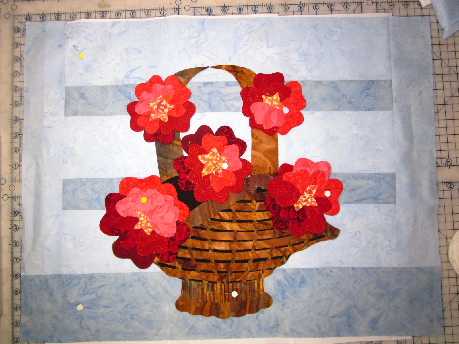
So, here it is. (Sorry for the lousy picture). All of the planned parts are glue basted. So far I'm pretty happy with how it's turning out. I used only batiks, and all from my stash. I think I really do need to add a little something more, it's not quite as sumptuous as I wanted. But I think whatever I add needs to be airy, light as a feather. I'll be playing with that today, along with the butterflies.

 
The basket design took a bit of thought. I didn't want it to steal the scene, so my first plan was to use just a single fabric and either embroider or quilt in the details.


When I got to this point I was really tempted to go with the embroidery. I kind of liked the rustic lines. I decided to go on with the plan to use bias strips and actually weave the basket, figuring if I didn't like it I could always start over. (Ahh, the joy of no deadline!)
 

Now I'm wondering if I made the under piece too dark, especially if I put it on a light background. That would be a pain to change, so I'm shouldering on for now. After finishing the butterflies, and deciding on the little accent flowers, it's off to the sewing machine. I'll start by stitching together the individual motifs, and then stitch together as much of them as I can, which will make it much easier to decide on that background.